| Description | GeneRatio | BgRatio | pvalue | p.adjust | qvalue | geneID | Count | group | |
| ID | |||||||||
| GO:0002455 | humoral immune response mediated by circulatin... | 22/178 | 150/18670 | 19.365993 | 16.222197 | 16.298589 | HLA-DQB1/CD55/IGHM/PTPRC/TRBC2/IGHG2/IGKV3-20/... | 22 | B6_up |
| GO:0006958 | complement activation, classical pathway | 20/178 | 137/18670 | 17.588789 | 14.989062 | 15.065454 | CD55/IGHM/TRBC2/IGHG2/IGKV3-20/IGHV4-34/IGHV3-... | 20 | B6_up |
| GO:0006956 | complement activation | 20/178 | 175/18670 | 15.453684 | 13.008859 | 13.085251 | CD55/IGHM/TRBC2/IGHG2/IGKV3-20/IGHV4-34/IGHV3-... | 20 | B6_up |
| GO:0038096 | Fc-gamma receptor signaling pathway involved i... | 18/178 | 139/18670 | 14.916693 | 12.675988 | 12.752379 | PTPRC/LYN/IGHG2/IGKV3-20/IGHV4-34/IGHV3-30/IGL... | 18 | B6_up |
| GO:0002673 | regulation of acute inflammatory response | 18/178 | 159/18670 | 13.871614 | 11.817674 | 11.894066 | HLA-E/CD55/IGHG2/IGKV3-20/IGHV4-34/IGHV3-30/IG... | 18 | B6_up |
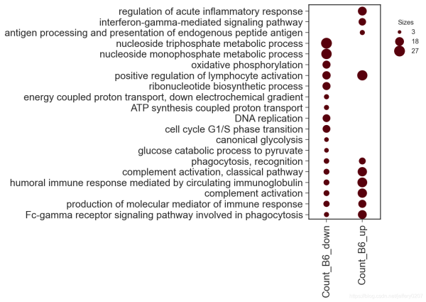
首先我们可以借助 DotPlot的类方法parse_from_tidy_data 对数据进行封装,然后直接调用plot函数进行绘图。当然,你也可以通过DotPlot的构造函数__init__()来实例化DotPlot对象。
new_keys = {'item_key': 'Description','group_key': 'group','sizes_key': 'Count'}
dp = dotplot.DotPlot.parse_from_tidy_data(data, **new_keys)
sct = dp.plot(size_factor=10, cmap='Reds')  # 通过size_factor 调节图中点的大小
dp = dotplot.DotPlot.parse_from_tidy_data(data, item_key='Description', group_key='group', sizes_key='Count')  # 该效果完全同上,这是python语言特性
sct = dp.plot(size_factor=10, cmap='Reds')

我们可以通过color_key指定data中的列做颜色映射。
new_keys = {'item_key': 'Description','group_key': 'group','sizes_key': 'Count','color_key': 'pvalue'}
dp = dotplot.DotPlot.parse_from_tidy_data(data, **new_keys)
sct = dp.plot(size_factor=10, cmap='Reds', cluster_row=True)
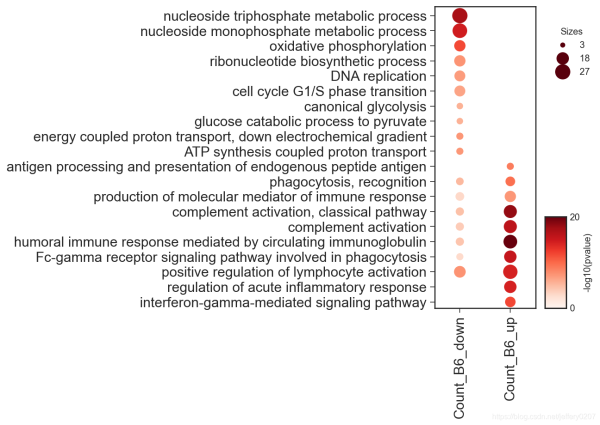
可以通过circle_key增加一列作为虚线圆圈的映射。
DEFAULT_CLUSTERPROFILE_KEYS = {
    'item_key': 'Description', 'group_key': 'group',
    'sizes_key': 'Count', 'color_key': 'pvalue',
    'circle_key': 'qvalue'
}
dp = dotplot.DotPlot.parse_from_tidy_data(data, **DEFAULT_CLUSTERPROFILE_KEYS)
sct = dp.plot(size_factor=10, cmap='Reds', cluster_row=True)
当然,更多的参数我们可以通过signature来查看,我对这些参数都做了类型注释,应该是通俗易懂的:
?dp.plot
Signature:
dp.plot(
    size_factor:float=15,
    vmin:float=0,
    vmax:float=None,
    path:Union[os.PathLike, NoneType]=None,
    cmap:Union[str, matplotlib.colors.Colormap]='Reds',
    cluster_row:bool=False,
    cluster_col:bool=False,
    cluster_kws:Union[Dict, NoneType]=None,
    **kwargs,
)
Docstring:
:param size_factor: `size factor` * `value` for the actually representation of scatter size in the final figure
:param vmin: `vmin` in `matplotlib.pyplot.scatter`
:param vmax: `vmax` in `matplotlib.pyplot.scatter`
:param path: path to save the figure
:param cmap: color map supported by matplotlib
:param kwargs: dot_title, circle_title, colorbar_title, dot_color, circle_color
            other kwargs are passed to `matplotlib.Axes.scatter`
:param cluster_row, whether to cluster the row
:param cluster_col, whether to cluster the col
:param cluster_kws, key args for cluster, including `cluster_method`, `cluster_metric`, 'cluster_n'
:return:
因此,我们可以通过关键字参数修改图例中的部分组件:
sct = dp.plot(size_factor=10, cmap='Reds', cluster_row=True,
dot_title = 'Count', circle_title='-log10(qvalue)',
colorbar_title = '-log10(pvalue)')

dotplot在数据可视化中是一个强有力的展示方式,选择一个合适的可视化方式胜过千言万语
最后,最适合的可视化方式是最直观、最简洁的,不是炫技,别被花里胡哨的可视化所迷住双眼而忽略了信息的传达。
到此这篇关于教你怎么用python绘制dotplot的文章就介绍到这了,更多相关python绘制dotplot内容请搜索脚本之家以前的文章或继续浏览下面的相关文章希望大家以后多多支持脚本之家!