前言:
大家一般都知道subplot可以画子图,但是subplots也可以画子图,鉴于subplots介绍比较少,这里做一个对比,两者没有功能一致。
对比开始:
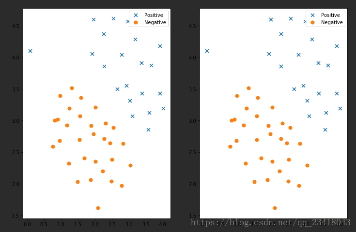
需求:画出两张子图,在一行显示,子图中的内容一模一样
subplot代码:
ax1 = plt.subplot(1,2,1)
ax1.scatter(positive['X1'], positive['X2'], s=50, marker='x', label='Positive')
ax1.scatter(negative['X1'], negative['X2'], s=50, marker='o', label='Negative')
ax1.legend()#添加图列就是右上角的点说明
ax2 = plt.subplot(1,2,2)
ax2.scatter(positive['X1'], positive['X2'], s=50, marker='x', label='Positive')
ax2.scatter(negative['X1'], negative['X2'], s=50, marker='o', label='Negative')
ax2.legend()#添加图列就是右上角的点说明
subplots代码:
fig, ax = plt.subplots(figsize=(12,8),ncols=2,nrows=1)#该方法会返回画图对象和坐标对象ax,figsize是设置子图长宽(1200,800)
ax[0].scatter(positive['X1'], positive['X2'], s=50, marker='x', label='Positive')
ax[0].scatter(negative['X1'], negative['X2'], s=50, marker='o', label='Negative')
ax[0].legend()#添加图列就是右上角的点说明
ax[1].scatter(positive['X1'], positive['X2'], s=50, marker='x', label='Positive')
ax[1].scatter(negative['X1'], negative['X2'], s=50, marker='o', label='Negative')
ax[1].legend()#添加图列就是右上角的点说明
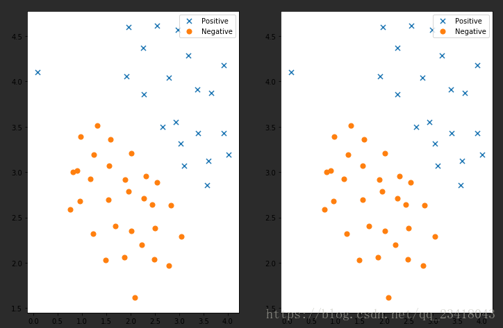
对比结果:
可以看出来两者都可以实现画子图功能,只不过subplots帮我们把画板规划好了,返回一个坐标数组对象,而subplot每次只能返回一个坐标对象,subplots可以直接指定画板的大小。
参考博客:Matplotlib的子图subplot的使用
参考博客:subplots与figure函数参数解释说明以及简单的使用脚本实例
到此这篇关于Matplotlib实现subplot和subplots简单对比的文章就介绍到这了,更多相关Matplotlib subplot和subplots内容请搜索脚本之家以前的文章或继续浏览下面的相关文章希望大家以后多多支持脚本之家!
您可能感兴趣的文章:- matplotlib subplots 设置总图的标题方法
- matplotlib subplots 调整子图间矩的实例
- Matplotlib 生成不同大小的subplots实例